
The Dashboard
Open Stax and you instantly know where you stand — key metrics up top, a colour-coded P&L calendar, your equity curve, and performance broken down by day and by symbol.
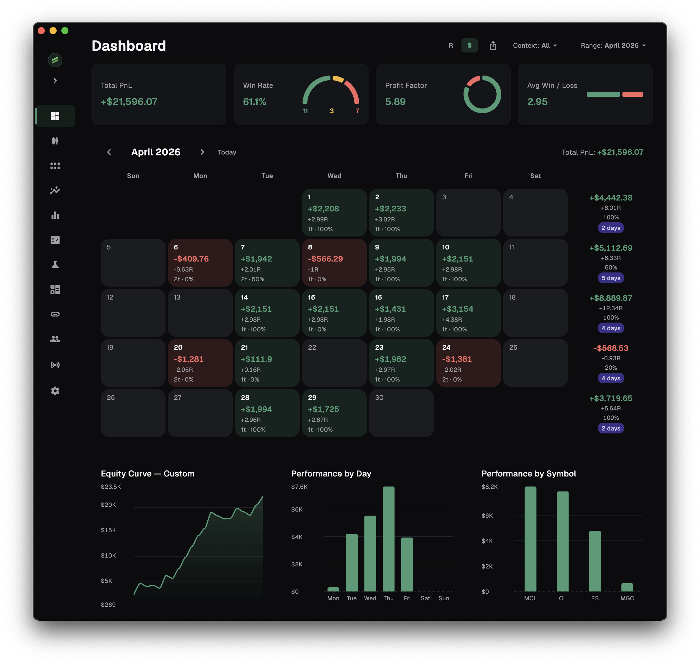
Most journals bury the one thing you actually want — am I making money? — under tabs and toggles. The Stax dashboard puts it first. It's the home screen of the app, and every number on it is fee-inclusive by default: you're reading Net P&L and Net R, what your account actually kept after commissions and spread, not a gross figure that looks good until reality arrives. And one Range control re-scopes the whole view at once — today, this week, a quarter, all time, your last N trades, or any custom date range.
Your key metrics, the moment you open the app
The top of the dashboard is a row of headline metrics — win rate, profit factor, expectancy, net P&L and average R — so the health of your account is the first thing you see, not something you go digging for.
Every figure is computed on the same honest engine the rest of Stax runs on. Wins and losses are counted the way you marked the trade, not by the P&L sign — a stop that briefly drifted green is still a loss, because that's how you traded it.
- Net by default — fees are inside the math, not bolted on after
- Win rate, profit factor, and expectancy front and centre, in net terms
- The same numbers flow into the Analytics Hub and the Full Report — one source of truth
Re-scope the whole dashboard to any range
At the top sits a single Range control, and it sets the window for everything beneath it. Choose Today, This Week, This Month, This Quarter, This Year or All, and every metric, the calendar and the equity curve recompute for exactly that span.
Need something specific? Custom opens a calendar to pick any start and end date, and # Trades scopes the view to your last N trades — you set the number. Whatever you pick, the dashboard, the Calendar screen and the Equity Curve screen all share the same range, so they always agree.
- Today · This Week · This Month · This Quarter · This Year · All
- Custom — any start-to-end date range
- # Trades — your last N trades, you choose N
- Every metric, the calendar and the equity curve re-scope together
A colour-coded P&L calendar
The calendar turns the selected range into a heat map of green and red days, so streaks, revenge-trading benders and your quiet, profitable weeks all jump out at a glance. Each day carries its net result, its trade count and its win rate, and a weekly column rolls those up so a strong week and a soft one are easy to tell apart.
Click any day to narrow the whole dashboard to just that day; drag across days to focus a stretch. Open the dedicated Calendar screen and the same grid gains a full metrics strip on top — total R, win rate, profit factor, average R per day, max drawdown — recomputed for whatever range you've picked.
Your equity curve
The equity curve plots your cumulative Net R as your trades close, so you see the real trajectory of your edge — the drawdowns, the recoveries and the flat stretches — instead of a single P&L number that hides all of it. It runs two-tone: green while you're above water, red below.
The dedicated Equity Curve screen goes further — switch between R and dollars, and turn on Live vs Backtest to overlay your real trading against your backtested results on the same chart. The dashboard keeps the shape of your account one glance away.
By day, by symbol
An aggregate win rate hides as much as it reveals. The dashboard breaks performance out by day of week and by symbol, so the instruments and days carrying your account — and the ones quietly draining it — are obvious without any setup.
When a pattern catches your eye here, the Analytics Hub is one click away to prove it across every dimension at once.
Frequently asked
Are the dashboard numbers gross or net?
Net. Every metric on the dashboard is fee-inclusive — Net P&L and Net R — so what you read is what your account actually kept after commissions and spread.
How are wins and losses counted?
By the result you marked on the trade, not by the raw P&L sign. A trade you stopped out of is counted a loss even if it briefly traded green, because that reflects how you actually traded it.
Do I need to connect a broker to see the dashboard?
No. Add trades manually, import a file, or connect a broker to sync them — the dashboard updates the moment trades land in your journal, online or fully local.
Can I see a specific period?
Yes. The Range control covers Today, This Week, This Month, This Quarter, This Year and All, plus a Custom start-to-end date range and a last-N-trades view. Everything on the dashboard — the metrics, the calendar and the equity curve — re-scopes to your choice, and the dedicated Calendar and Equity Curve screens share the same range.
See your real numbers in minutes
Free to start, local-first, on macOS and Windows. No card required.