
The Analytics Hub
One screen, six tabs. This is where your trade history stops being a list and starts telling you exactly where your edge lives — pick a tab to go deep.
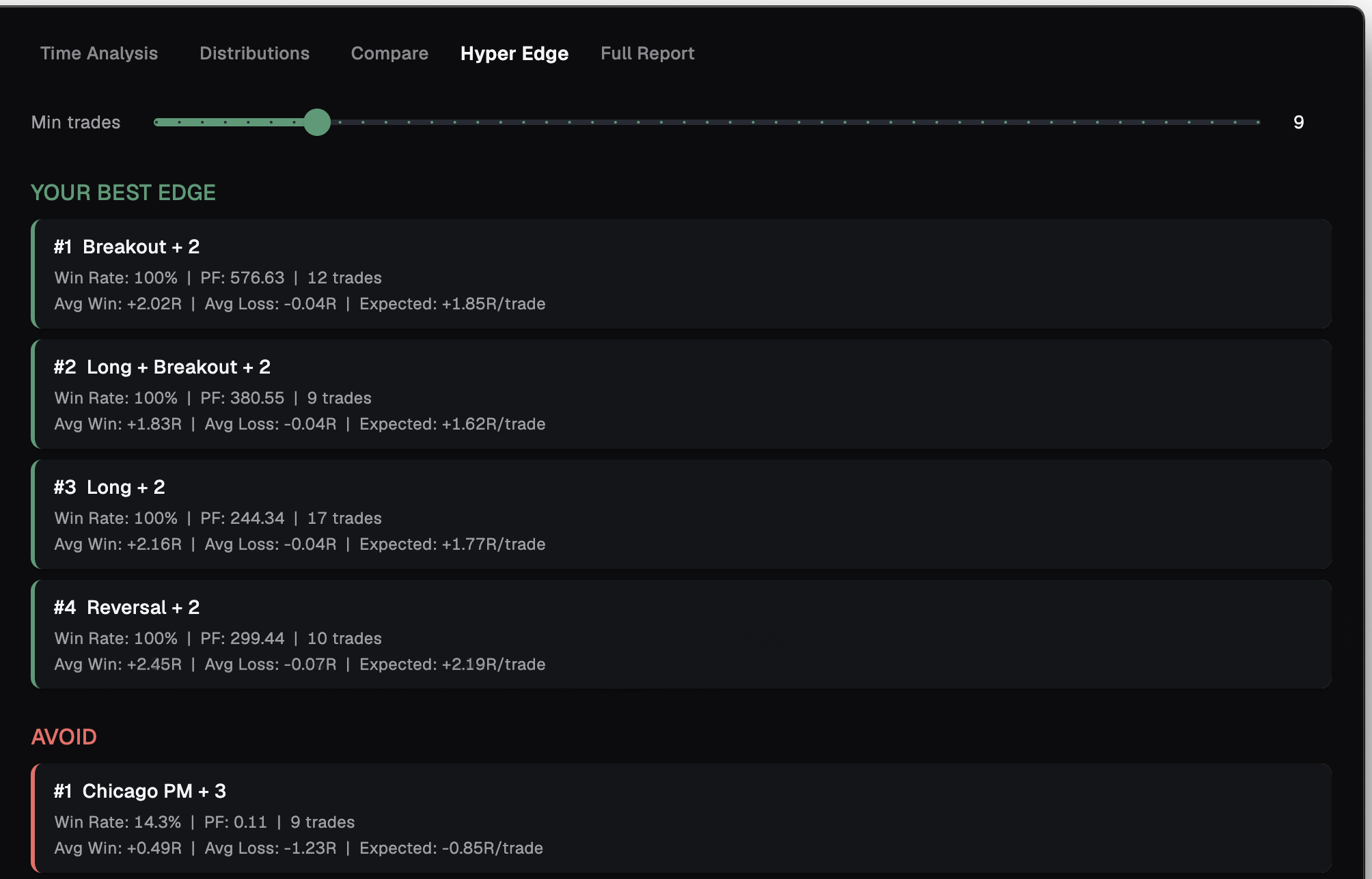
The dashboard tells you how you're doing. The Analytics Hub tells you why. It's one screen with six tabs, and they share two principles that make the numbers trustworthy: every figure is fee-inclusive Net R, and wins and losses are judged by the result you marked — not the P&L sign. Most tabs carry a one-tap R / $ toggle so you can read your edge in risk multiples or in dollars.
The six tabs
each its own deep-diveFrequently asked
What are the six tabs in the Analytics Hub?
Time Analysis, Distributions, Compare, Hyper Edge, the Full Report — and the Psyche Profile, which reads who you are when you trade. They live on one screen and all run on the same fee-inclusive Net R math.
Where is the heatmap?
The Hour × Day heatmap lives inside the Time Analysis tab — three aligned grids for Avg P&L, Win % and Volume across hour-of-day and day-of-week.
Can I read everything in dollars instead of R?
Yes. Time Analysis, Distributions and Compare carry a one-tap R / $ toggle; the Full Report shows both.
Do Calendar and Equity Curve live here too?
Those are their own screens, surfaced on the Dashboard. The Analytics Hub is the deep-analysis side: timing, distributions, comparison, the edge-finder, the full report and the psyche profile.
Find where your edge actually lives
Free to start, local-first, on macOS and Windows. No card required.