
Compare
Progress is a comparison. Compare puts two slices of your own history side by side and shows the delta.
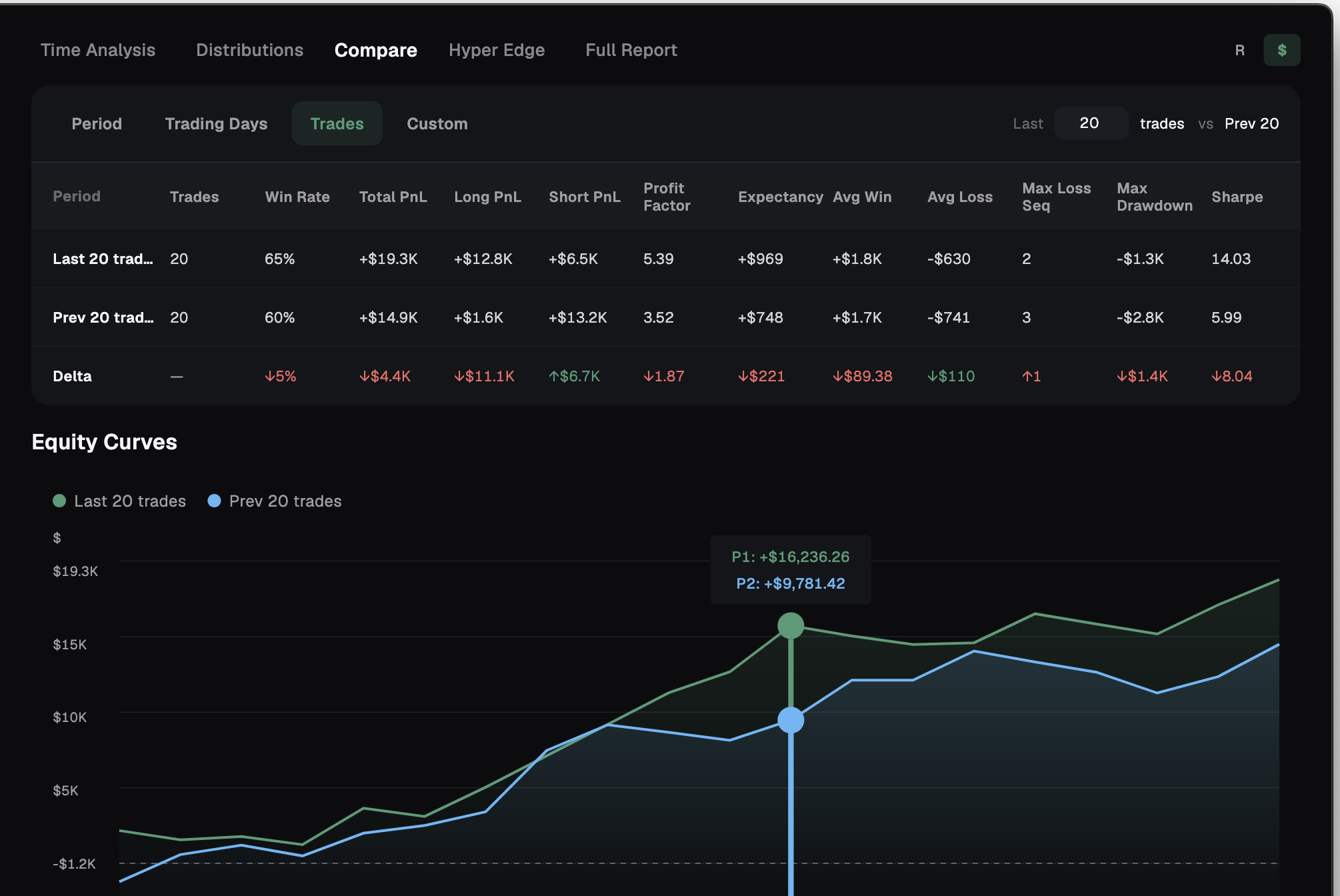
It is easy to feel like you are improving and be wrong. Compare settles it. It takes two slices of your own history, lines up the metrics, and shows the delta between them — so "am I getting better or worse?" stops being a feeling and becomes a number.
Two slices of your history, side by side
Compare lays the metrics out as a transposed scorecard. The metrics run across as columns, and there are three rows: Period 1, Period 2, and Delta.
The Delta row is the point. It reads green-up when the change is good and red-down when it's bad, so better and worse are obvious at a glance with no mental math.
When a slice has no data for a metric, the Delta shows an em-dash, never a fake zero. An honest blank beats a misleading number.
- Trades, Win Rate, Total P&L (or Total R)
- Long and Short
- Profit Factor, Expectancy
- Avg Win, Avg Loss
- Max Loss Streak, Max Drawdown, Sharpe
If one period has nothing to measure, the Delta says so with an em-dash. A zero would read like a real result. A blank tells the truth.
Four ways to define before-vs-after
What counts as before and after is up to you. Pick the framing that matches the question you're asking.
- Period — this week vs last, this month vs last, this quarter vs last, or today vs yesterday.
- Trading Days — your last N active days against the previous N, anywhere from 1 to 30.
- Trades — your last N trades against the previous N, regardless of when they happened.
- Custom — two date ranges you set yourself on a dual-month calendar.
Two equity curves, overlaid
Below the scorecard, the two periods' Equity Curves sit on a single chart — now in green, before in blue.
The table gives you the verdict; the overlay gives you the story. You can see whether the gain came steadily or from one stretch, and whether the newer curve is smoother or just luckier.
An R / $ toggle covers everything here — the scorecard and the curves both.
Frequently asked
What am I comparing against?
Your own history. Compare puts two slices of your record side by side — never anyone else's.
What does the em-dash mean?
No data for that metric in one of the periods. Compare shows an em-dash instead of a fake zero so the blank reads honestly.
How do the deltas show direction?
Green-up when the change is good, red-down when it's bad. The color and arrow tell you which way each metric moved.
Can I compare in R instead of dollars?
Yes. An R / $ toggle switches the entire view — scorecard and equity curves — between risk multiples and dollars.
Settle whether you're improving
Free to start, local-first, on macOS and Windows. No card required.